Learn how a monochromatic paint color palette creates drama and dimension—and infuses any space with style and sophistication.
Understanding the basics of color helps elevate your interiors. Here, you’ll discover how the creative combination of different shades in the same hue, known as a monochromatic color scheme, yields an elegant environment in any room.
Monochromatic Colors
What is a monochromatic color scheme? Simply put, it’s a palette that involves a single hue, and an excellent way to layer in color and drama. There are two distinct monochromatic styles:
- Single Shade:
- A single shade color scheme uses one color without any variation in hue.
- This approach makes choosing trim color a snap, since everything will be the same color.
- The powerful effect of a single shade can be enhanced further by using different paint sheens on your trim and moldings.
- Multiple Shades:
- A multiple shade color scheme uses several shades of the same hue, as well as shades with varying undertones.
- Using multiple shades of one color softens the look of a monochromatic palette, imbuing relaxing energy into any space.
- This approach can make a room look bigger and is ideal for enhancing small spaces.
- Always a great resource, the color wheel is integral to interior design: Check out these highlights to see how the color wheel can help with your paint color search!
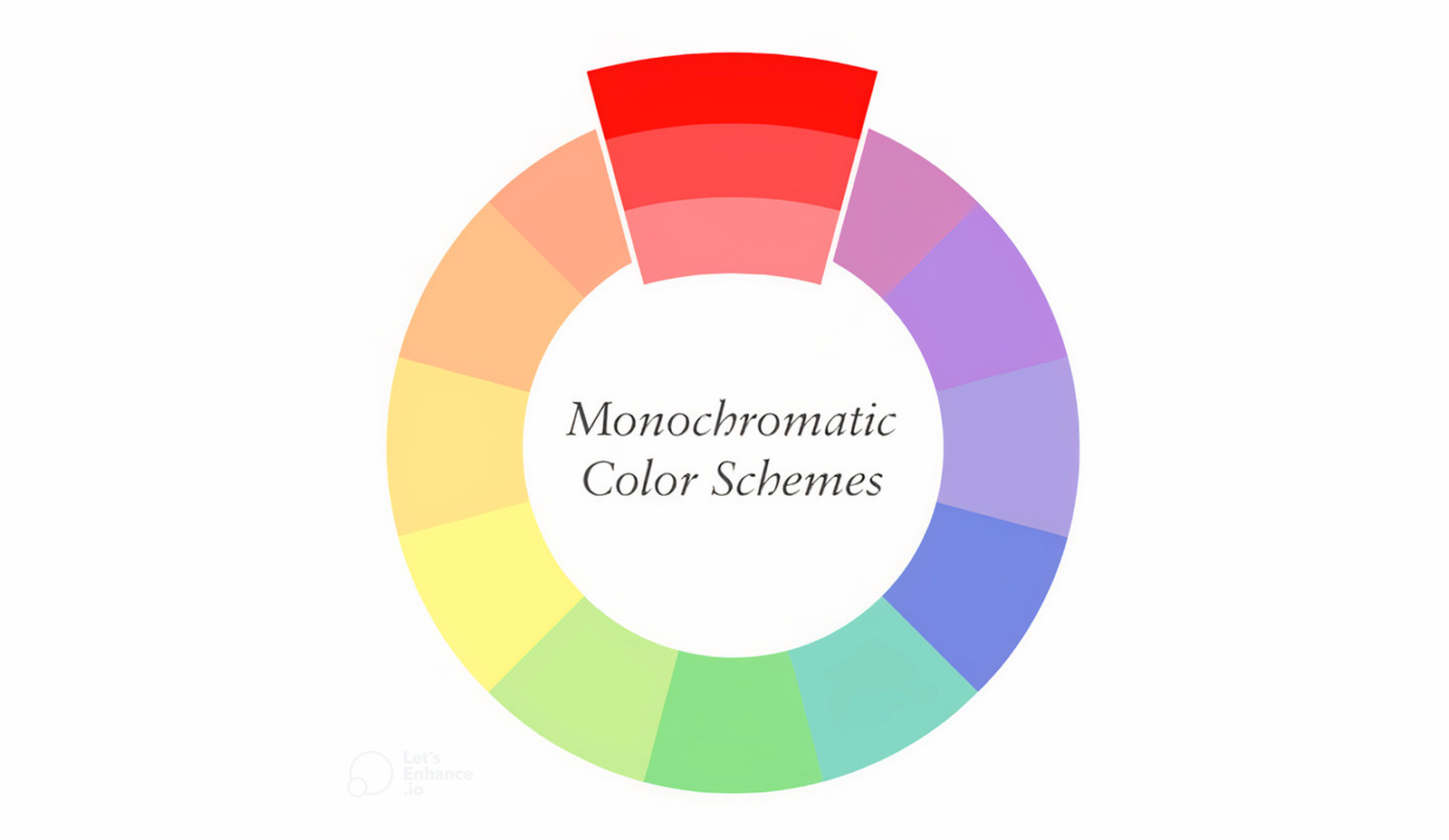
Monochromatic Color Palettes
To help you shape your own monochromatic color scheme, use these curated palettes by color family, created by our color experts.
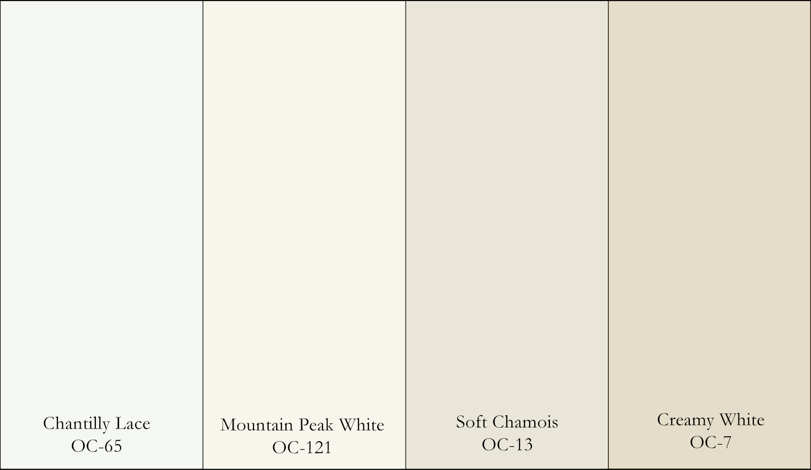
White Paint Colors
Bring subtle dimension to your space by layering white paint colors.
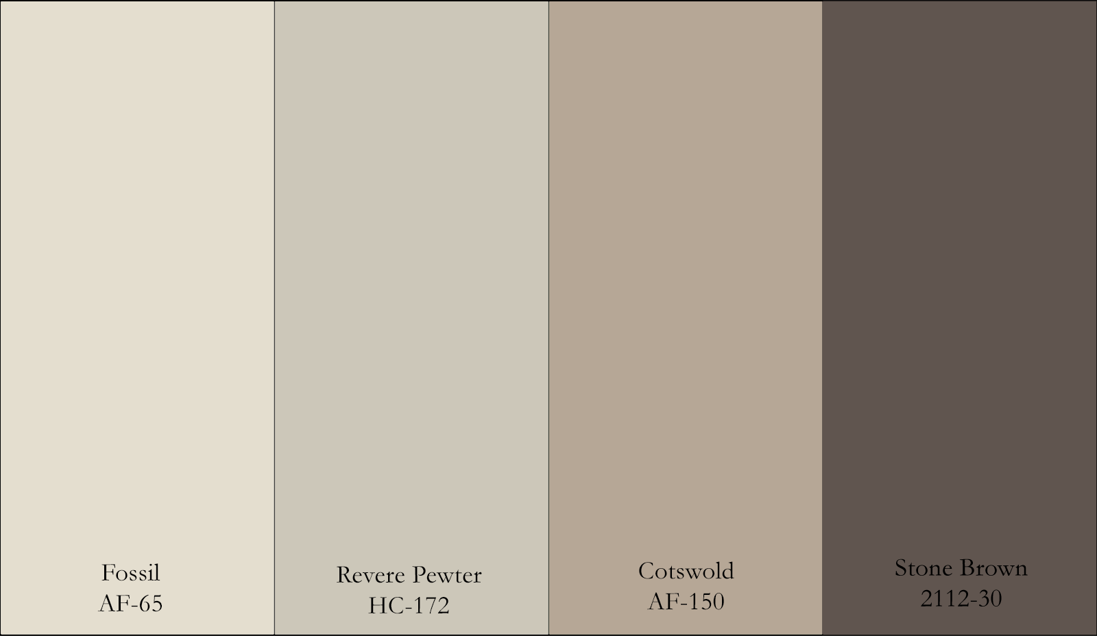
Blue Paint Colors
Build a calming space using a diverse range of blue hues.
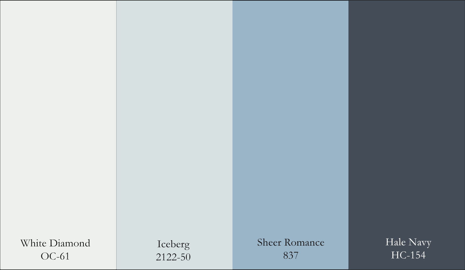
Purple Paint Colors
Create a luxurious, romantic atmosphere with varying shades of purple.
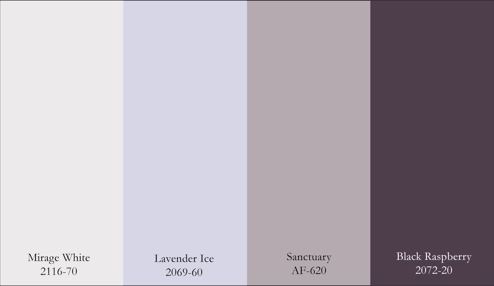
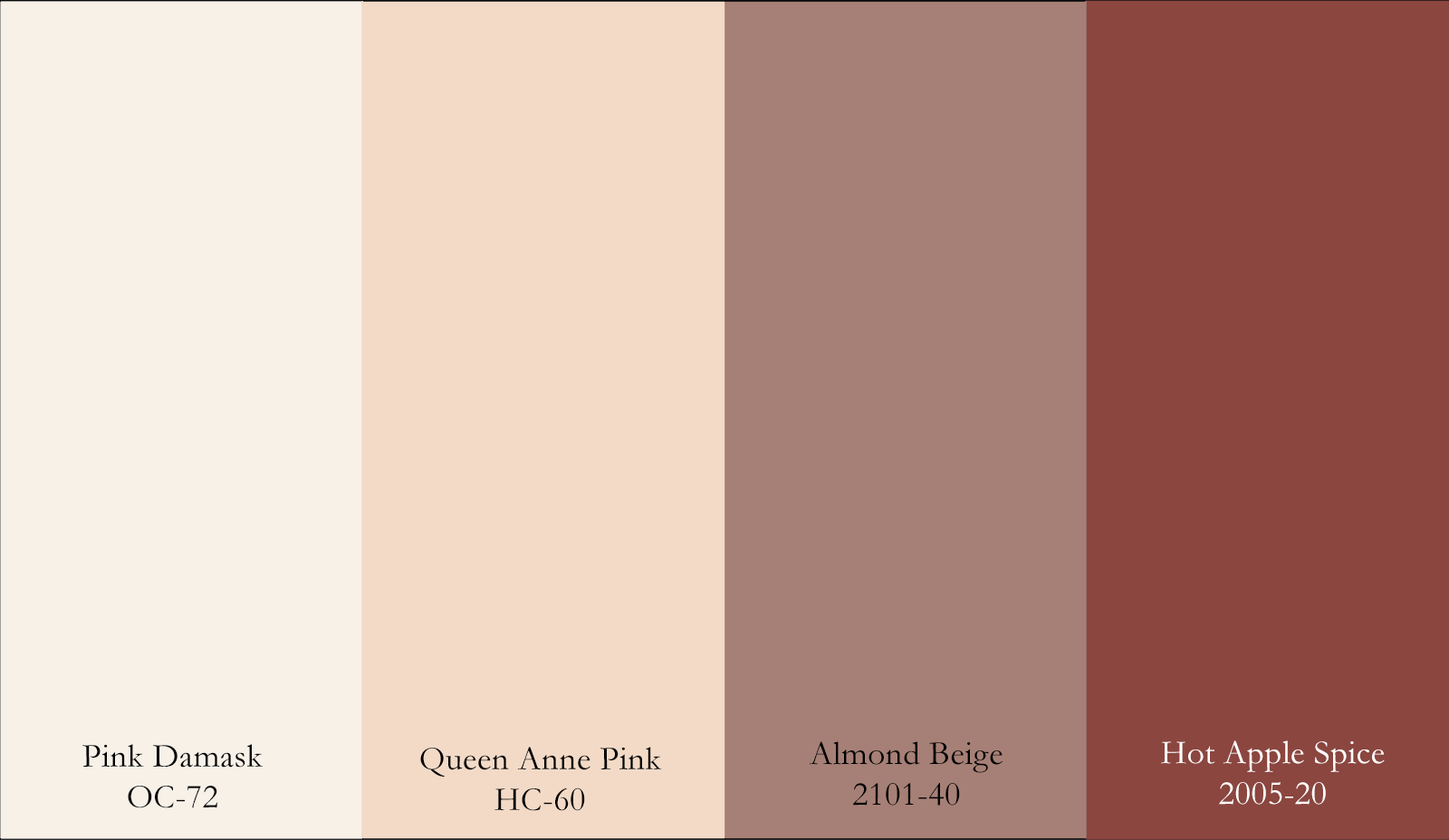
Examples of Elevated Monochromatic Color Schemes
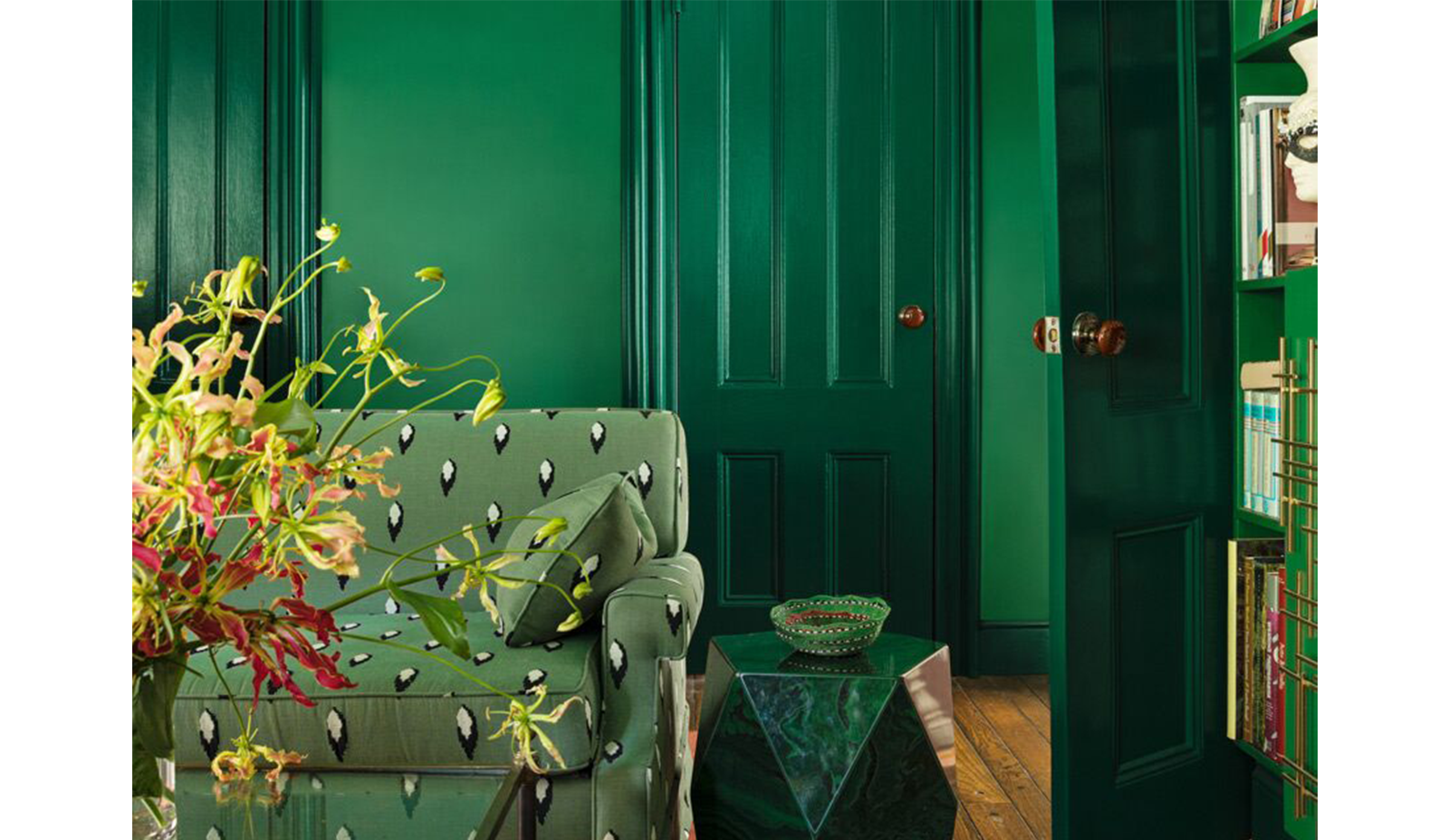
This saturated monochromatic study evokes the feeling of a lush jungle. Trim and doors in Rainforest Foliage 2040-10 pack a powerful punch in a high-gloss sheen, a beautiful contrast against matte walls in Amazon Moss 2037-10.
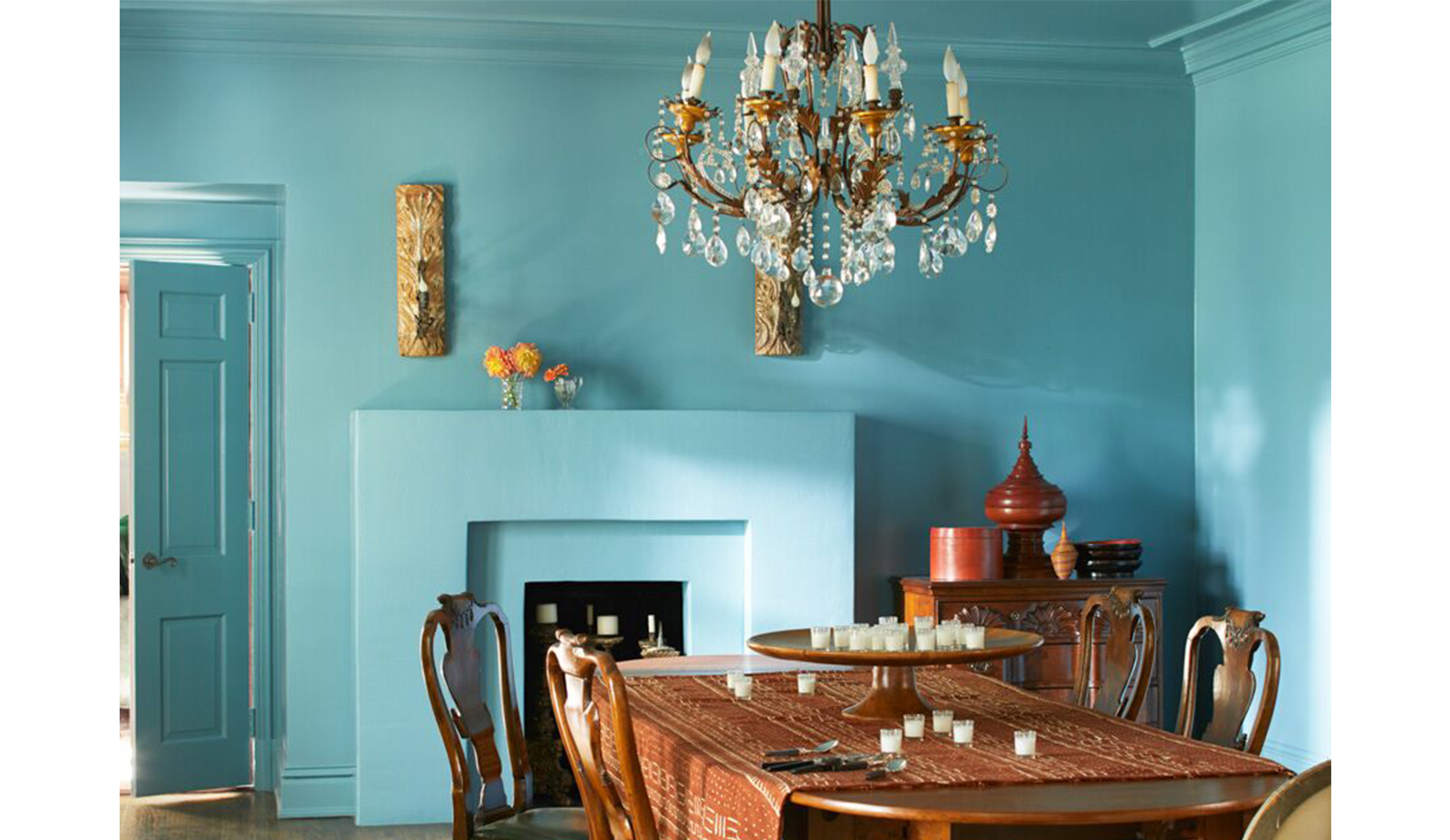
Bold, dramatic, opulent. This Spectra Blue 2049-50 dining room showcases the power of a monochromatic color scheme. Experimenting with sheen in unexpected places, like a semi-gloss ceiling, creates a luminous look ideal for dining in style.
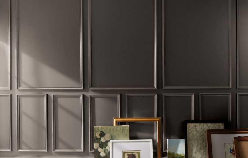
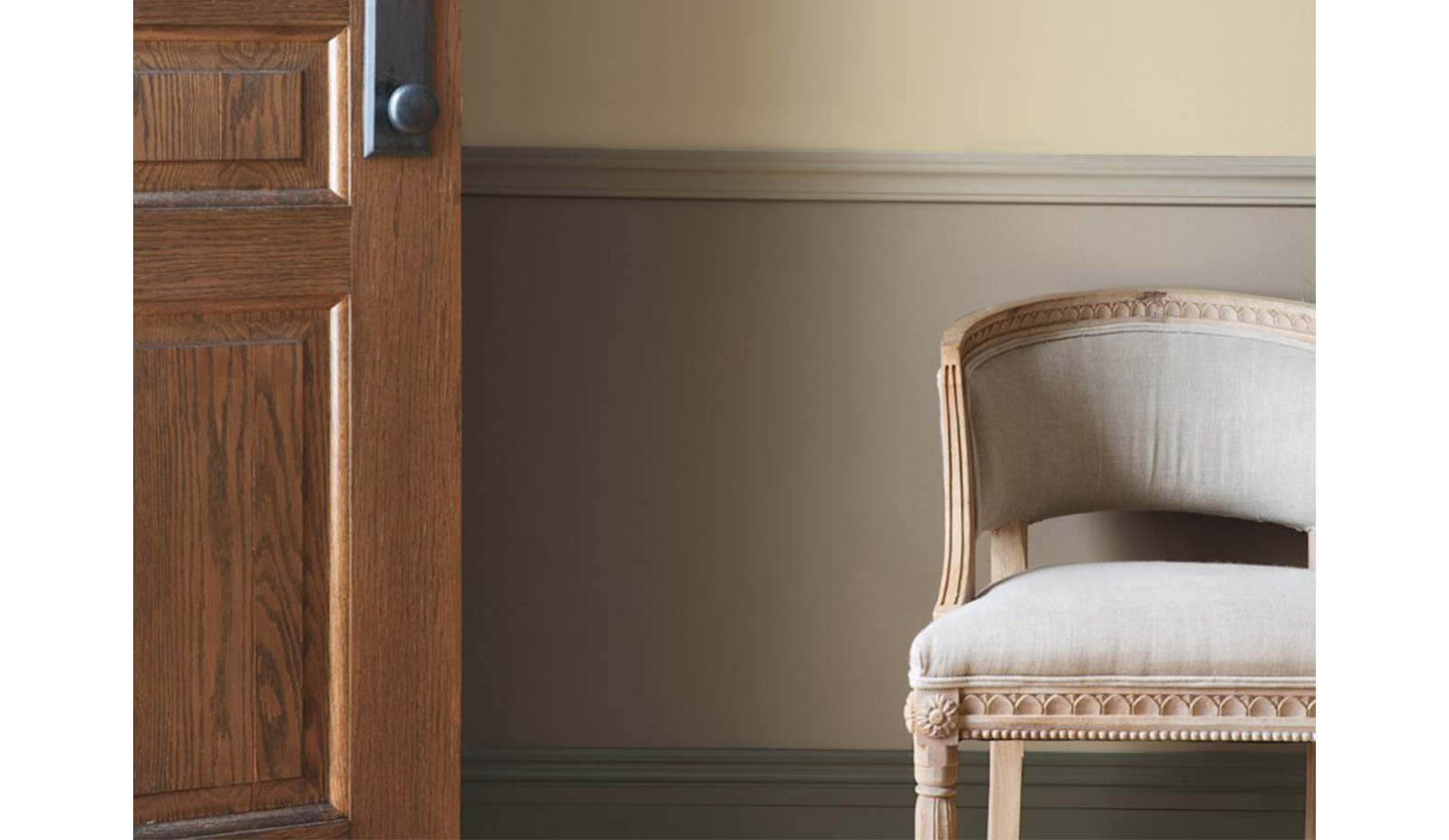
Creating a monochromatic palette with neutral colors can be tricky, but when you get it right, the result is classic. Try mixing slightly different undertones within one hue, seen in this taupe entryway, to create a subtle contrast between shades.
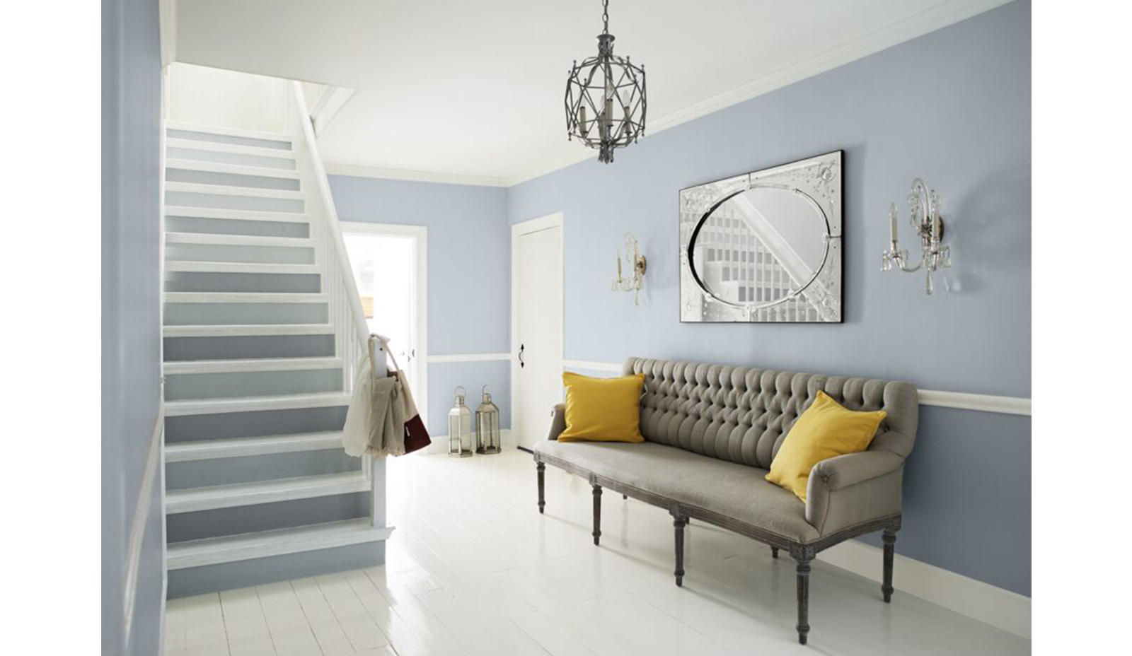
Welcome guests with a monochromatic color palette of cool grays with subtle violet undertones. Try a dual-toned staircase to bring whimsy to a sophisticated space.
This entryway is painted in Feather Gray 2127-60 and Pike’s Peak Gray 2127-50, both from Color Preview®, a color collection that ranges from bright and vibrant, to more subtle versions of the same hues. Use Color Preview as a helpful resource to create monochromatic color schemes in your space!
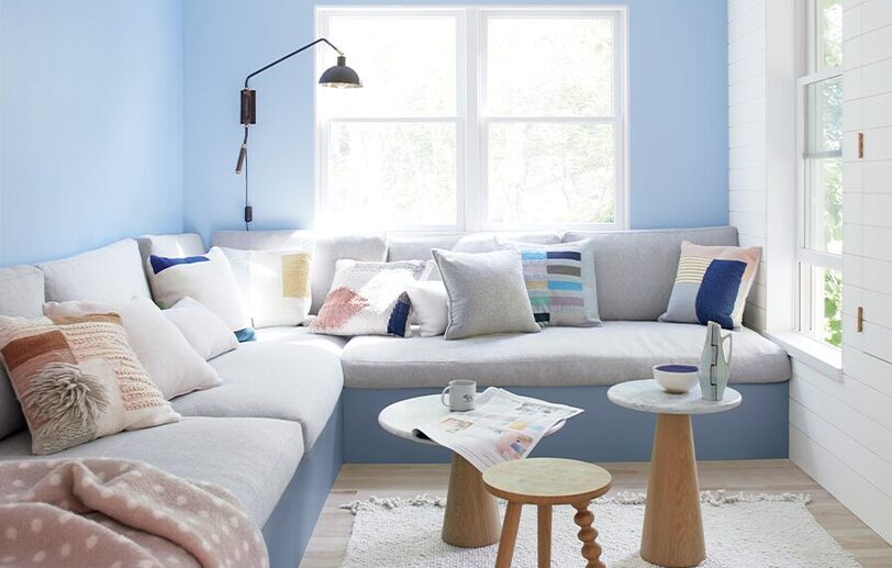
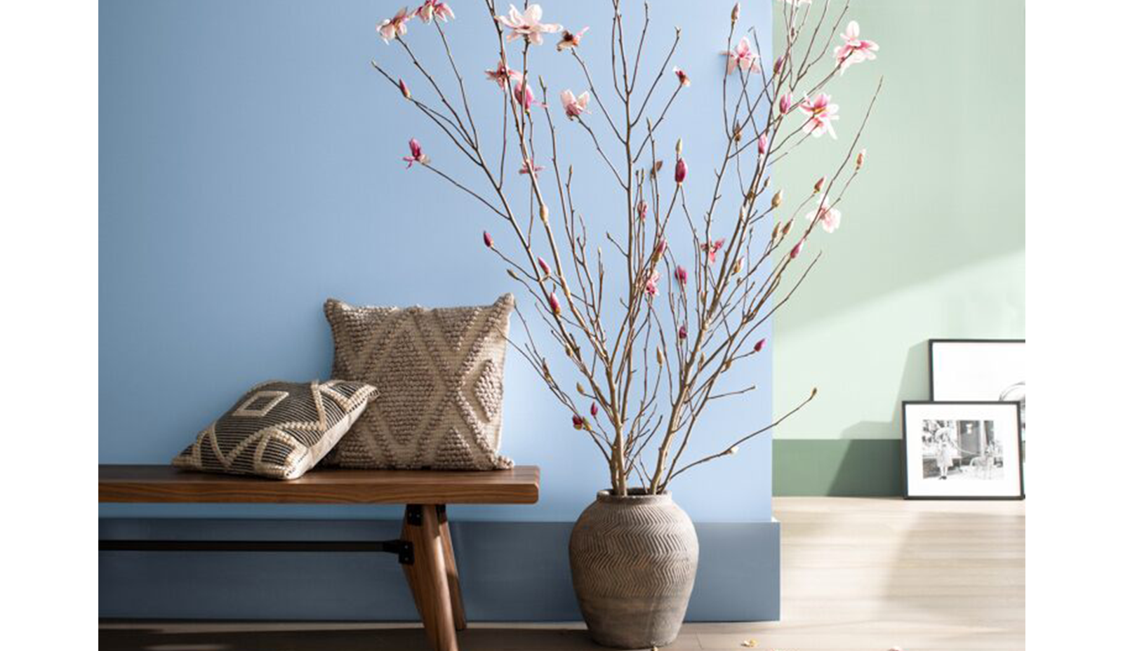
Using two monochromatic color schemes in one room creates a contemporary color blocking effect. Here, a living area is broken into separate spaces using two distinct hues. Trim and wall in the same color family is a clever way to bring a unique spin to monochromatic color schemes.
Monochromatic schemes in Marbella interiors
A monochromatic palette is one of the most useful tools for Costa del Sol projects where you want quiet sophistication that doesn't fight the natural light. Pick a single hue — say, a warm grey from our Gray family — and layer it across the room in three or four tonal values: a soft chalky shade on the walls, a slightly deeper version on built-ins or trim accents, a saturated darker note on a statement wall or velvet upholstery, and a near-white for ceilings and millwork.
For Marbella light, we recommend Aura® matte on the main walls (its pigment depth keeps the tonal hierarchy intact under bright sun) and Advance® alkyd in semi-gloss on trim. Pair the scheme with natural materials — travertine, oak, linen, brass — and the result reads as quietly luxurious rather than monotone. Visit our boutique at Calle Dublín 21 and we can swatch a complete monochromatic palette in any colour family for your specific project, with paint-can samples so you can verify each tonal step at home in real light.
Monochromatic schemes work especially well in master bedrooms, formal dining rooms, and home libraries where the eye benefits from a calm, unified backdrop. They're also forgiving on furniture sourcing — almost any wood tone, fabric weight, or metal finish reads well against a tonal background, which means your project stays flexible as the rest of the interior comes together.